NUOMI
Brand Image Revitalized Debut
Why rejuvenate the brand’s VI (Visual Identity)?
By understanding the essence of minimalism and whole house solutions, NUOMI has grown alongside the global mid-to-high-end market. Today, our product integration, aesthetic competitiveness, and brand influence are constantly strengthening.
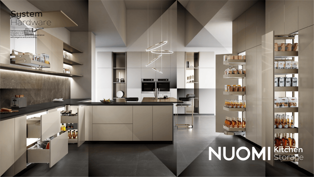
NUOMI’s “Whole-house Hardware” strategy has timely evolved into a ” Whole-house Hardware Ecological Chain” with the differentiating “Four Same Rule” of same style, same color, same quality, and same brand, once again leading the industry’s development trend.
In order to align with the brand’s new strategic changes, NUOMI needs to reach households with a more high-end and international brand image, empowering the operational expansion of global regional markets.
Taking multiple factors into consideration, NUOMI’s brand new VI (Visual Identity) image has emerged.
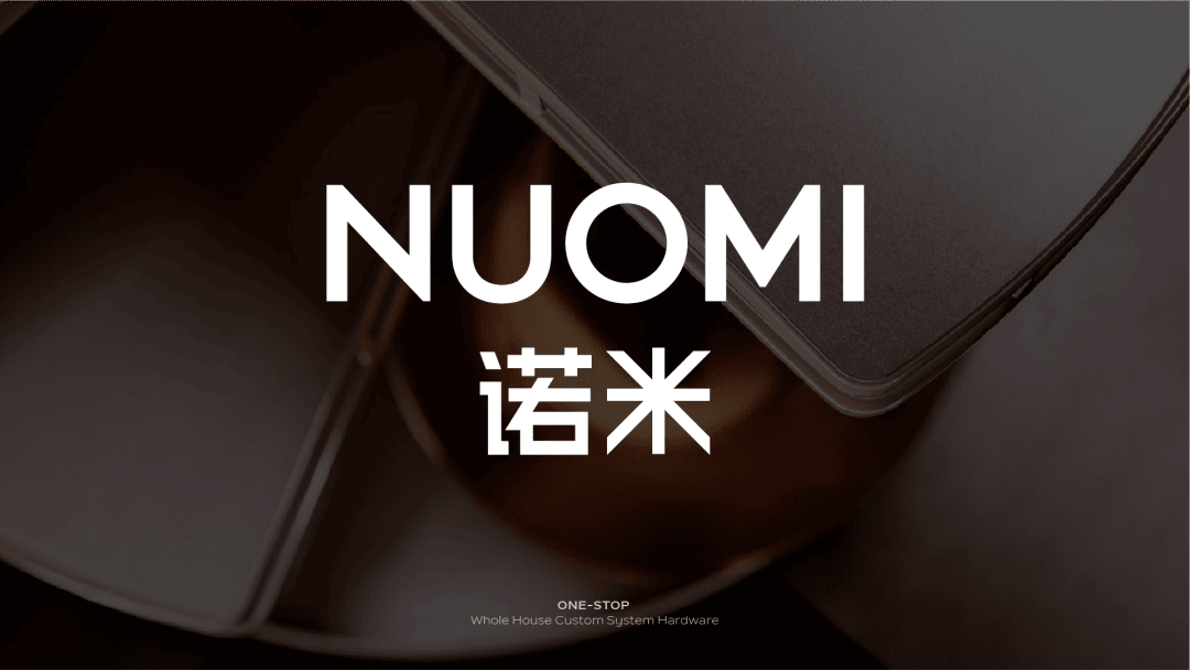
New Logo · Transcendent Evolution
Simplicity is the key to building a successful global brand.
When we look at the evolution history of international big brands like Apple, Mercedes-Benz, Nike, and others, without exception, simplicity plays a crucial role.
In the era of information explosion, the impact and clarity of a logo have become key design elements. A concise logo aligns with people’s desire to reduce complexity and return to simplicity, making it easier to recognize and propagate in multimedia and offline settings.
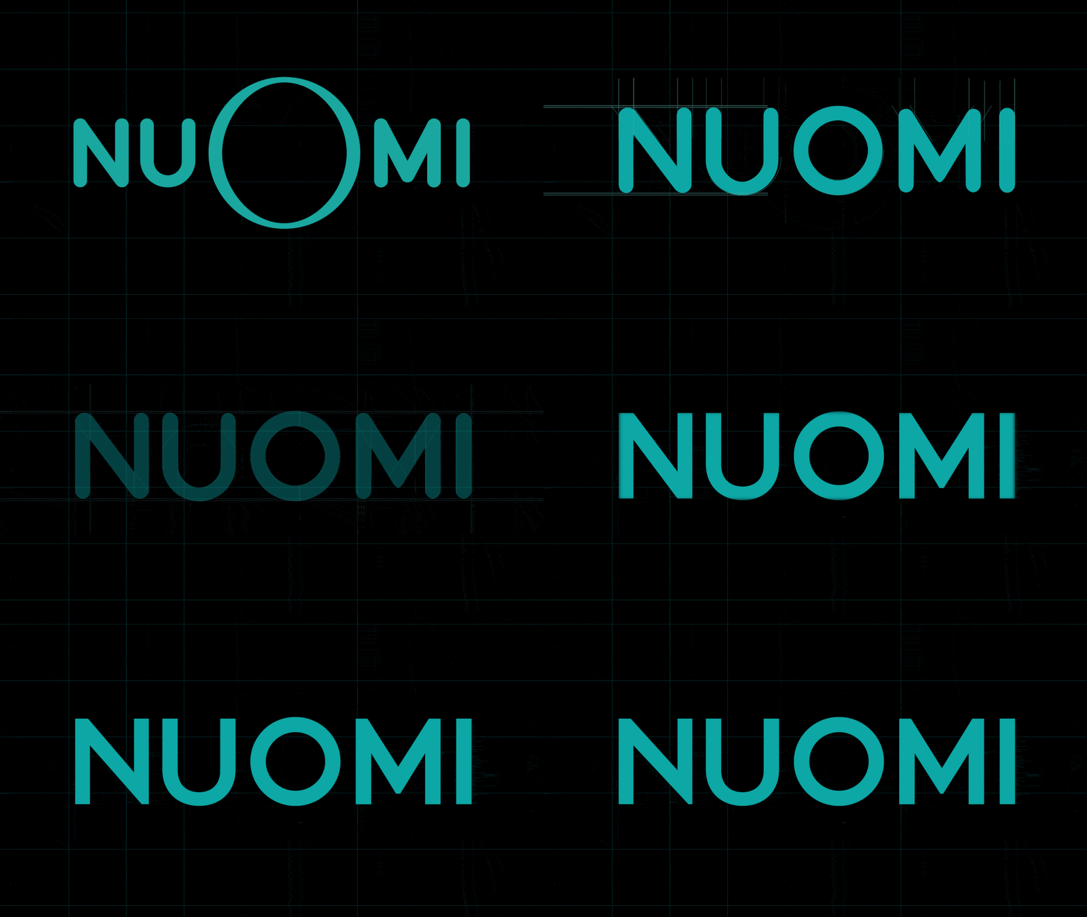
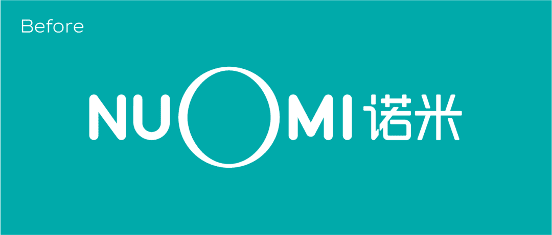
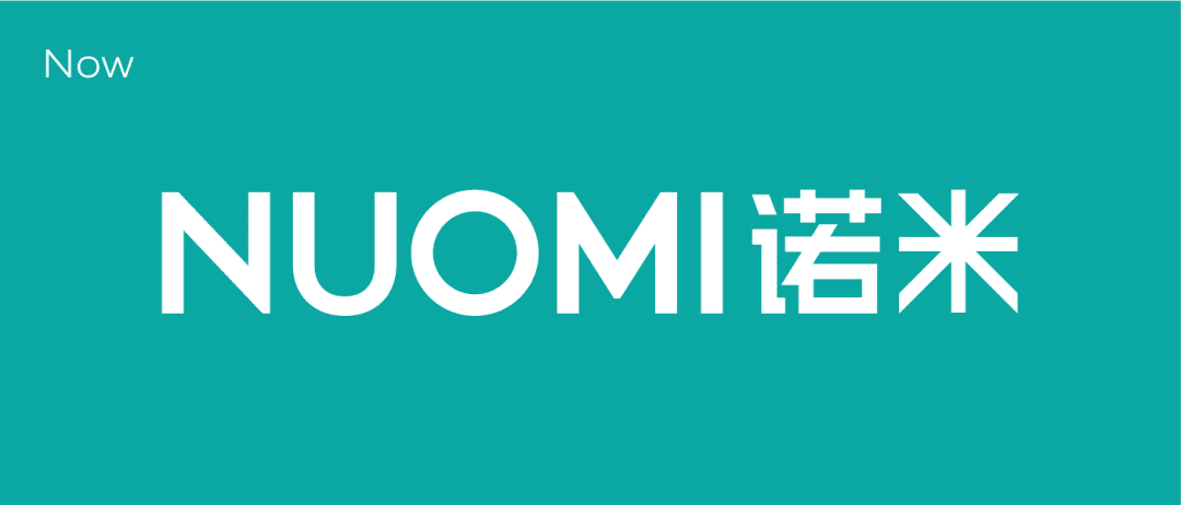
NUOMI employs the Bauhaus-style minimalist design, removing the curved decorative elements of the logo, enhancing the outlines of the sans-serif font, reducing unnecessary visual noise, and endowing the emblem with greater geometric balance and visual stability.

After optimization, the new NUOMI logo stands out more prominently.
With attributes of stability, strength, and precision craftsmanship, it conveys a more professional, reliable international brand impression with technological sense.
Super Symbol · Breaking Boundaries
“NUO” in Chinese means “promise and commitment”.
A promise is worth a thousand gold, it is the foundation of the enterprise.
“MI” in Chinese means “nanometer, refinement”.
It originates from the creation system that pursues excellence in quality and aesthetics in design.
From precision materials to sophisticated craftsmanship, and leading intelligent manufacturing, NUOMI insists on independent research and development, creating internationally renowned products. It is committed to making “NUOMI” synonymous with high-quality in the hardware industry.
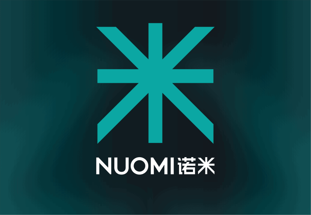
In this new era, how can we further interpret the brand?
The team creatively distilled the Chinese character “米” (MI) and transformed it into a visual symbol for the brand. Building upon the foundation of quality, they expanded its conceptual meaning.
Nowadays, “MI” is not only a name but also a symbol, and its connotation has gained more diverse expressions.
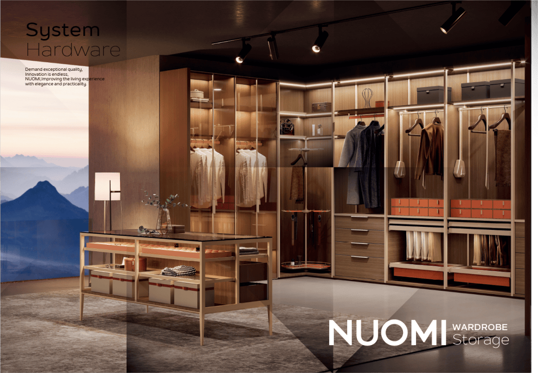
Starting from the core of hardware
Breaking the boundaries of home furnishings, connecting diverse customized scenarios
Treating whole-house hardware as the “soul”
Various categories endow the entire home furniture with dynamic functionality
The aesthetic of matching colors for whole-house hardware
Coordinating the overall home aesthetics for a unified enhancement
On the basis of precise quality, the “MI” symbol conveys the concept of NUOMI pursuing product innovation, striving for excellence, and seeking win-win situations. It also presents the brand’s potential for diverse development.

New Color Series · Unchanged Identification
NUOMI’s brand new color system aligns with international aesthetic trends.
“NUOMI Green” retains its exclusive identification, while making slight adjustments to the saturation of the original tone, symbolizing vitality and a sense of happiness, becoming even more composed and sophisticated.
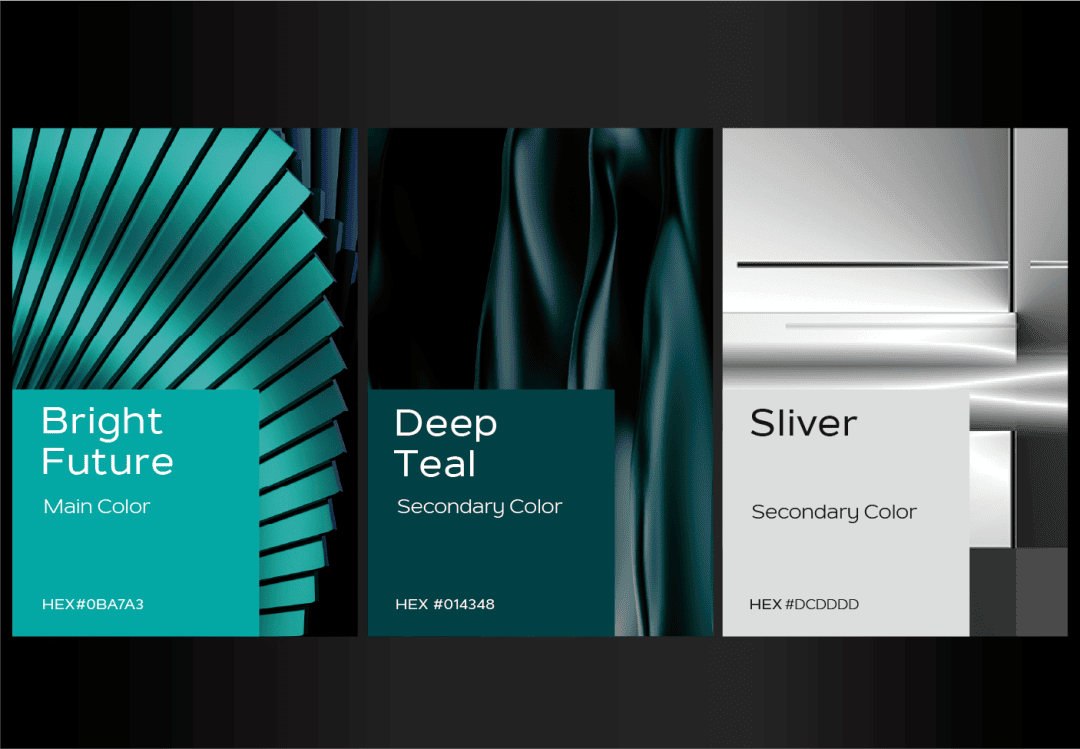
The newly added auxiliary colors, such as deep green and gray silver, originate from the aesthetic principles of high-end luxury goods. They enrich the levels and textures of the design, and also prevent the monotonous fixation of the NUOMI colors. The modern, elegant, and exquisite brand temperament emerges vividly.
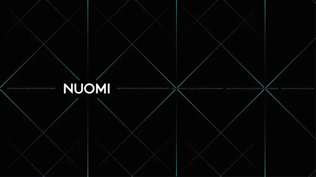
“MI” Pattern · Unforgettable at First Glance
In order to adapt to digital and multi-scene applications, NUOMI has for the first time taken the “MI” pattern as the basic unit of the super symbol, creating an exclusive brand visual carrier.
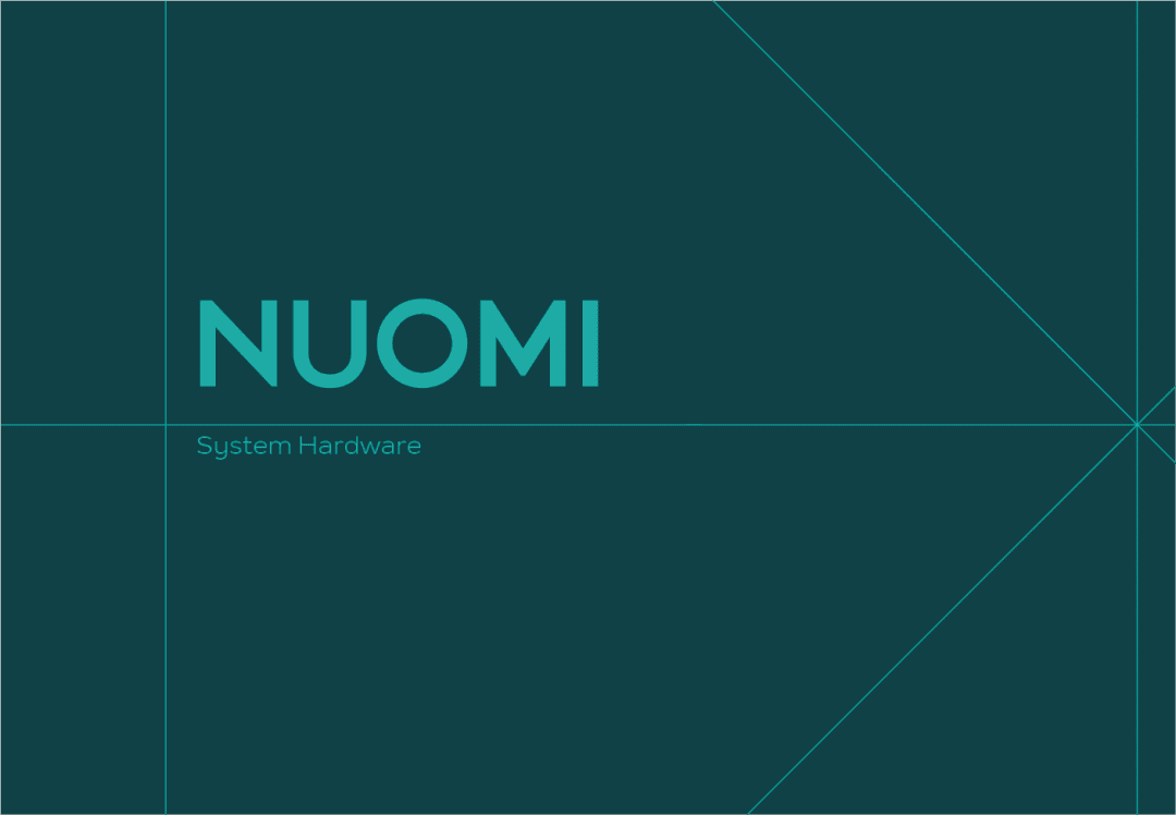
NUOMI translates its diverse forms of lines and surface patterns into various scenarios, cleverly enhancing memory points and dynamic rhythms, collectively interpreting a unique visual language with a sense of futurism, luxury, and quality.
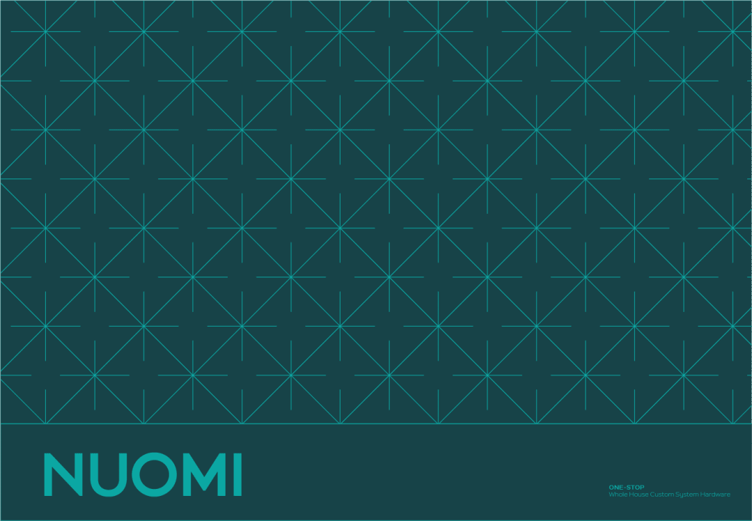
The concise geometric graphics are not just patterns but embody the concept of “the whole-house hardware ecosystem.” They symbolize the connection between people and every aspect of their lives at home, further reinforced and communicated through the patterns.
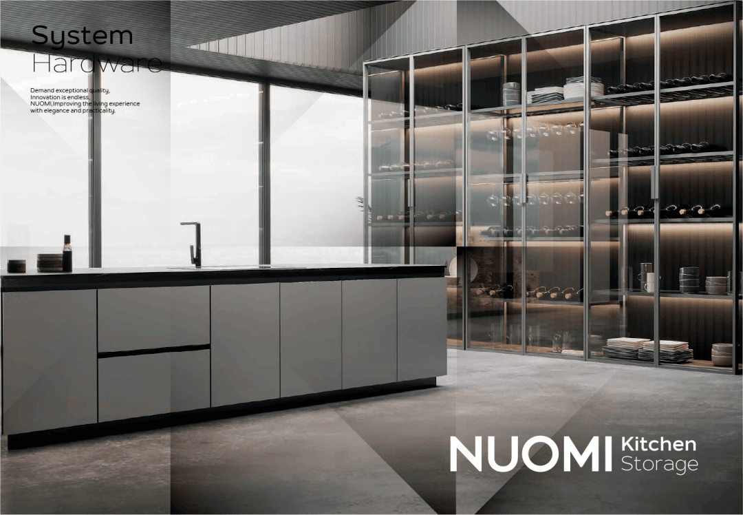
NUOMI · New Starting Point
This forward-looking brand rejuvenation outlines NUOMI’s imagination and expectations for the future. With a focus on functional hardware as its core competitiveness, NUOMI extends its advantages to cover the entire range of home hardware categories, empowering business value for the B-end and creating a refined lifestyle for the C-end.
NUOMI aims to redefine itself as a provider of advanced global home living solutions, rather than just a manufacturer of whole-house hardware.
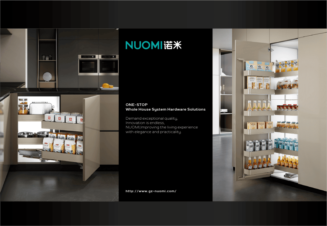
Stay calm and gather momentum, rushing towards a new beginning
In the future, NUOMI will continue to practice the “whole-house hardware ecosystem” and create globally recognized quality products, unleash new potential for the brand, create value for customers, and work together with distribution partners to surpass new heights in our careers!
